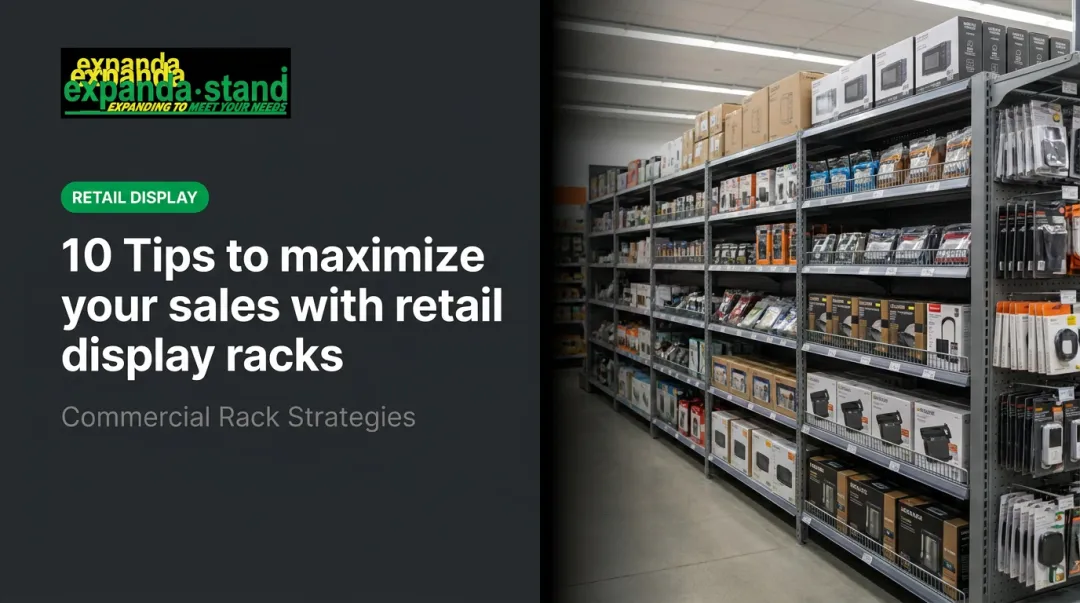
Introduction
Walk into two stores selling identical products. One feels inviting — the lighting is warm, the shelves are clean, the colours make you want to linger. The other feels flat, clinical, or just off. You leave faster without quite knowing why.
The difference is usually colour.
Colour in retail is not decoration. It is a sales tool operating below the level of conscious awareness. Research published in Management Decision by Singh (2006) found that people form judgements about a product within 90 seconds, with 62%–90% of that assessment based on colour alone.
This post covers:
- The psychology behind retail colour choices
- A colour-by-colour breakdown of what works and why
- Colour schemes matched to specific store types
- A practical framework for building your store's palette
Key Takeaways
- Colour directly shapes how shoppers feel, how long they stay, and whether they buy — making it one of the most underused tools in retail design.
- Warm colours (red, orange, yellow) signal urgency and energy; cool colours (blue, green) build calm and trust; neutrals let products lead.
- Different store types need different colour strategies — a pharmacy and a fast-fashion shop should never share the same palette.
- Use the 3-colour rule (60% dominant / 30% secondary / 10% accent) to stay cohesive without overwhelming shoppers.
- Colour should guide the customer journey: energising at the entrance, calming in browsing zones, and action-prompting near checkout.
Why Colour Is Your Store's Silent Salesperson
Shoppers react to your store's colour palette before they consciously evaluate a single product in it. Colour triggers emotional and physiological responses subconsciously — and that gives retailers a non-verbal communication advantage.
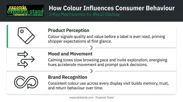
Three Ways Colour Drives Consumer Behaviour
Research by Bellizzi and Hite (1992), conducted in simulated retail settings, confirmed that store colour affects consumer feelings and purchase likelihood. Here is how that plays out in practice:
- Product perception — Customers associate colours with quality, value, and purpose before reading a label. A black-framed display signals premium; a yellow shelf tag signals a deal.
- Mood and movement — Calming colours slow shoppers down and encourage browsing. Energising colours create urgency and faster decision-making.
- Brand recognition — Consistent colour use across walls, fixtures, and signage helps customers identify and remember a brand across visits.
Space and Atmosphere
Colour also changes how a space feels physically. Lighter palettes make compact stores feel open and airy. Darker, richer tones create intimacy and a sense of luxury in larger footprints. The right choice depends on the experience you want shoppers to have — and the category you sell.
Know Your Audience
Colour preferences are not universal. A 2015 hue-preference study found male preferences peaked in the blue-green range, while Arabic and English female preferences shifted toward different hue bands entirely.
A 2022 cross-cultural study found that Western participants showed stronger green-positive and red-negative associations than Mainland Chinese participants. That is a meaningful gap for any retailer operating across markets. Always test your palette against your actual target audience before committing — especially in India's culturally diverse retail landscape.
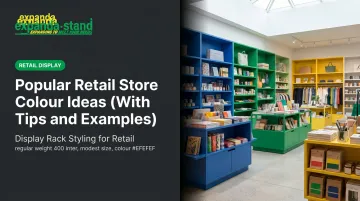
Popular Retail Store Colour Ideas: A Complete Breakdown
Warm Colours: Red, Orange, and Yellow
Red is the most attention-commanding colour in retail. It raises heart rate, creates urgency, and is closely tied to sales, promotions, and impulse decisions. Shopping-context research by Bellizzi and Hite identifies red as the more tense option compared to blue — overuse as a dominant wall colour reduces comfort and shortens browsing time.
Red works best as an accent: sales signage, promotional zone highlights, and entrance features that draw the eye without dominating the atmosphere.
Orange carries red's energy with a friendlier, more approachable tone. Babin, Hardesty, and Suter's study found orange interiors can perform well — particularly for perceived price fairness — when paired with soft, controlled lighting. Without that lighting context, orange can easily tip into overwhelming. It suits value-oriented retailers, youth brands, and food-adjacent environments where warmth and affordability are the message.
Yellow is the first colour the human eye detects. It signals cheerfulness and optimism, but its intensity makes it a poor wall colour for most stores. As an accent or zoning colour — particularly in produce and fresh food sections — it works well. Walmart's grocery redesign by Lippincott used yellow alongside green and orange specifically to signal freshness and food credentials.
Cool Colours: Blue and Green
Blue has the strongest evidence base of any retail colour. YouGov's global survey found blue was the favourite colour in 10 countries across four continents, leading other colours by 8–18 percentage points. In retail-specific research, Babin et al. found that blue fashion-store interiors produced more favourable evaluations, higher patronage intentions, and greater purchase intentions than orange interiors.
The variation matters, and it is worth choosing deliberately:
- Soft pastel blue — invites lingering, signals calm; ideal for pharmacies and wellness retail
- Bold cobalt — projects confidence and precision; suits electronics and financial services
- Navy — adds authority and depth; works well in premium fashion and professional environments
Green connects to nature, health, and sustainability — which is why it dominates organic food retail and wellness brands. Starbucks and Whole Foods have built global store identities around it, with Whole Foods' Brooklyn location designed around environmental stewardship principles.
Deeper forest greens carry wealth and elegance; lighter mint greens feel fresh and growth-oriented. Green is a strong choice for India's growing organised health retail sector, where natural and wellness cues resonate strongly with consumers.
Prestige Colours: Purple and Black
Purple carries centuries of royal association. It signals luxury, creativity, and imagination — making it a natural fit for beauty brands, boutique fashion, and high-end lifestyle retail. Deep aubergine tones add drama; softer lilacs bring an unexpected calm. Purple works best as a statement feature rather than a base colour, paired with warm metallics or natural materials to avoid feeling cold.
Black is one of the most effective backdrop colours in retail. It makes colourful products appear more vivid and striking by contrast — a reason why premium retailers use black fixtures and walls to frame hero products. VMSD's retail lighting guidance adds an important caution: spotlights pointed only downward in an all-black environment can feel oppressive. Lighting walls vertically creates spaciousness and keeps the space from closing in on the customer.
Neutral Tones: White, Grey, and Beige
Neutrals are the backbone of many retail colour strategies because they do not compete with products — letting merchandise drive the experience.
- White signals cleanliness, simplicity, and modernity — ideal for premium fashion, tech, and pharmacy environments.
- Warm grey communicates modest professionalism without the coldness of pure white.
- Earthy beige brings warmth and approachability — popular in organic, artisan, and lifestyle retail contexts.
The risk with neutrals is flatness. They need layering — texture through materials, accent colours from the brand palette, and deliberate lighting — to avoid a generic, forgettable atmosphere.
Colour Schemes by Retail Store Type
Fashion and Apparel Stores
Most successful fashion stores use a neutral base — soft white, warm grey, or light stone — to ensure clothing and accessories remain the visual hero. A bold accent wall or branded colour detail (navy, emerald, dusty coral) then adds personality and helps direct customer movement through the store.
- Minimalist and luxury fashion: muted, airy palettes with warm lighting and natural textures
- Fast fashion and youth brands: higher saturation, brighter accents, bolder contrasts
The base stays calm; the brand colour does the signalling.
Health, Wellness, and Pharmacy Stores
Health and wellness environments need to communicate cleanliness, safety, and calm. Soft blues, pale greens, and clean whites achieve this by connecting subconsciously to nature and healing — encouraging customers to browse at a relaxed pace and trust what they see.
This holds across pharmacy chains, supplement retailers, and natural food stores. The effect is consistent: customers slow down, feel reassured, and spend more time browsing.
Electronics and Tech Stores
Tech retail typically uses monochromatic white, grey, and black to create a clean, high-precision aesthetic. The absence of competing colour lets products function as the visual centrepiece.
Accent colours play a targeted role in this environment:
- Electric blue or neon green: signals a technology-forward edge on feature displays
- Dark charcoal backgrounds: makes screens and product finishes pop visually
- Minimal colour overall: prevents distraction and keeps focus on product specs
Grocery, Supermarkets, and Hypermarkets
In high-traffic environments, colour serves navigation as much as emotion. The Walmart redesign by Lippincott is the clearest verified example: yellow, green, and orange on the grocery side signal freshness and food credentials, while blue separates general merchandise and reinforces brand identity. Colour-coded zones with strong overhead signage let customers navigate intuitively without needing to think about it.
For Indian hypermarkets and supermarkets operating across large floor areas, the same logic applies: assign a distinct colour identity to each zone before selecting fixtures or signage.
Luxury Boutiques and Specialty Stores
Luxury retail uses restraint as a signal of quality. Rich, deep tones — charcoal, deep plum, forest green, black — paired with warm metallics (gold, brass, copper) and natural materials create intimacy and exclusivity. Fewer, more deliberate colour choices communicate that nothing in the store is accidental.
Warm, low-key lighting amplifies the effect of these darker palettes significantly. A deep olive wall under flat fluorescent light reads completely differently than the same wall under warm recessed spotlights with vertical wall washing.
How to Choose Your Store's Colour Palette: The 3-Colour Rule
The 60-30-10 Framework
The most practical starting point for retail palette building is the 3-colour rule, a design convention documented by both Sherwin-Williams and Benjamin Moore:
| Role | Share of Visual Space | Where It Appears |
|---|---|---|
| Dominant colour | ~60% | Walls, large surfaces |
| Secondary colour | ~30% | Fixtures, shelving, secondary surfaces |
| Accent colour | ~10% | Signage, decorative elements, promotional highlights |
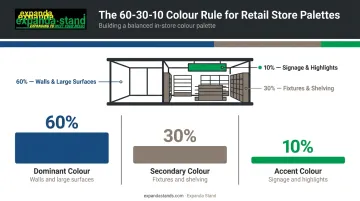
This prevents visual overwhelm while still creating personality and depth. Stores that use too many colours at similar visual weights end up feeling chaotic — no single element draws the eye or reinforces the brand.
Once you have a framework in place, four practical factors should shape which specific colours you choose.
Four Factors Before You Commit
- Brand identity — Store palette should complement, not fight, logo colours and brand materials.
- Target demographics — Age, gender, and cultural background all affect colour perception. Test with your actual audience.
- Lighting conditions — Natural and artificial light can shift how a colour reads on the wall. Always test paint samples under actual store lighting before finalising.
- Competitor differentiation — Review what your local competitors are using. The colour no competitor uses may be your biggest visual differentiator.
Colour Scheme Types
Three structures from the colour wheel are most useful in retail:
- Analogous (neighbouring hues): creates harmony and calm, making it well-suited to browsing-led environments like clothing boutiques or bookshops
- Complementary (opposite colours): generates contrast and energy; works well in promotional zones and high-impact display areas
- Monochromatic (one hue in varying tones): produces a sophisticated, unified look that suits premium or brand-forward retail environments
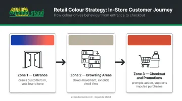
Using Colour Strategically Across Store Zones
Guiding the Customer Journey with Colour
Colour zoning means using intentional shifts in hue, tone, or saturation across different areas of the store to direct the customer experience:
- Entrance: Bolder, more energetic colours or accent features draw customers in and signal what kind of store this is within seconds.
- Browsing areas: Softer, neutral tones encourage slower movement and longer dwell time where product discovery happens.
- Checkout and promotional displays: Warmer or more urgent tones — red and orange accents in particular — prompt action and support impulse purchases.
Fixtures as Part of the Colour System
Colour zoning does not stop at walls. Every surface a customer interacts with is part of the palette — floor treatments, ceiling finishes, signage, and critically, the display fixtures and shelving.
The finish and tone of store fixtures should harmonise with the wall palette. Common approaches include:
- Dark-toned shelving against a neutral wall — creates elegant contrast that keeps focus on the product
- Warm timber shelving against a white wall — reads artisan and approachable
- Powder-coated steel in a brand accent colour — turns shelving into a brand statement
Expanda Stand's retail display fixtures and shelving systems can be specified with custom powder-coat finishes, produced through an in-house automated powder coating line, to complement your store's chosen colour scheme directly. Finish selection can be part of the overall fit-out conversation from concept stage onward. For specific finish options and colour matching, contact the team at sales@expandastands.com with your store's palette and product requirements.
Maintaining Visual Flow Between Zones
Avoid sharp, jarring colour transitions between zones. Instead, use:
- Graduated tonal shifts (lighter to deeper within the same colour family)
- Consistent material accents — a repeating timber detail or metallic finish — that thread through the whole store
- Signage and graphics that carry a unified colour language across departments
The goal is that customers feel the zones shift without noticing the mechanism.
Frequently Asked Questions
What colour is best for retail?
There is no single best colour — the right choice depends on store type, target audience, and brand identity. Blue and green are broadly trusted and calming, red is effective for urgency and promotions, and neutral tones serve as safe backgrounds that let products stand out.
What is the 3-colour rule?
Choose one dominant colour covering 60% of visual space (walls and large surfaces), one secondary colour at 30% (fixtures and shelving), and one accent colour at 10% (signage and highlights). This keeps the store visually cohesive without overwhelming shoppers.
What are the 7 colour schemes?
The seven common schemes are monochromatic, analogous, complementary, split-complementary, triadic, tetradic (square), and neutral. In retail, monochromatic, analogous, and complementary schemes are most commonly used for their balance of harmony and contrast.
How do retail store colours affect customer behaviour?
Colours trigger emotional and physiological responses. Warm colours build urgency, cool colours encourage trust, and neutrals reduce visual distraction. Together, these effects shape dwell time, purchase decisions, and brand perception.
Should store wall colour match the brand logo colours?
Store colours do not need to replicate logo colours exactly, but should complement and reinforce brand identity. Placing logo accent colours on feature walls, signage, and fixtures builds consistent brand recognition without overwhelming the space.
How often should a retail store refresh its colour scheme?
Interior colour schemes typically benefit from a refresh every 5–7 years, or sooner if the brand identity evolves or wear and fading become visible. Between repaints, seasonal accent updates through signage, displays, and fixtures keep the environment feeling current.