According to POPAI's 2012 Shopper Engagement Study, 76% of supermarket purchase decisions are made in-store — meaning the layout you choose directly shapes whether customers buy at all, and how much.
This guide covers everything you need to make those decisions count: what retail store layout means, the main types, the floor plan elements that actually move product, and a practical planning process you can follow from day one.
Key Takeaways
- 76% of purchase decisions happen in-store — layout directly shapes what customers see, pick up, and buy
- Six layout types — from grid to free-flow — suit different store sizes and shopping experiences
- Key floor plan elements include the decompression zone, power wall, aisle width, and impulse purchase zones
- A five-step planning process helps you move from goals to a measurable, optimized floor plan
- Modular, reconfigurable fixtures let you adapt without shutting down operations
What Is a Retail Store Layout and Why Does It Matter?
A retail store layout is the intentional arrangement of product displays, fixtures, aisles, and open space to guide how customers move through your store and influence what they buy. Done well, it shapes the entire shopping experience — from first impression to final purchase.
The business case is direct. When customers move through more of your store, they encounter more products. More product encounters lead to more unplanned purchases. POPAI's research found that more than 1 in 6 purchases occurred when a display for that brand was present in-store, and that 13% of recorded eye fixations went to in-store displays. What you put where, and how visible it is, changes buying behavior.
The reverse is equally true. A poorly planned layout actively costs you sales:
- Congested aisles frustrate shoppers into leaving sooner
- Dead zones leave high-value products unseen
- Disorienting pathways push customers toward the exit before they're done browsing
A well-planned layout must balance four core factors:
- Customer flow — how people move through the space naturally
- Product visibility — what gets seen, and in what order
- Space utilization — the ratio of selling space to storage and circulation
- In-store experience — whether the environment encourages browsing or rushing
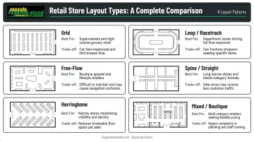
Types of Retail Store Layouts
No single layout suits every retailer. The right choice depends on store size, product range, and the shopping experience you want customers to have. Here are the six main types.
Grid Layout
The grid uses parallel aisles with shelving on both sides, directing foot traffic in a predictable path. It's the most common layout in supermarkets, pharmacies, and hardware stores because it maximises display space and is intuitive for shoppers to navigate.
Pros: Efficient use of floor space, familiar to shoppers, easy to stock and restock Cons: Can feel monotonous; limited scope for experiential retail
Loop / Racetrack Layout
A loop layout creates a defined circular path that carries customers past the majority of merchandise before reaching checkout. It maximises product exposure and suits department stores and experiential retail formats.
The trade-off: shoppers with a specific purchase in mind can find it frustrating. RFID path research by Larson, Bradlow, and Fader analysing 8,751 grocery shopping paths found that shoppers rarely follow a prescribed route. They use the perimeter as a base and take short aisle excursions. Design your loop with that behaviour in mind.
Pros: Maximum product exposure, suits browsing-oriented shoppers Cons: Frustrating for goal-directed shoppers; requires strong signage at key decision points
Free-Flow Layout
Free-flow layouts have no defined pathways. Customers wander and discover products organically, which suits boutiques, lifestyle stores, and high-end retailers where browsing and ambience are priorities.
The risk: without clear signage and logical product groupings, customers feel disoriented. Free-flow works best when the product range is curated and the visual merchandising is actively guiding customers through the space.
Pros: Encourages discovery and impulse purchases; supports premium brand experiences Cons: Risk of customer disorientation if signage and product groupings are weak
Spine / Straight Layout
A single central aisle runs from entrance to back, with secondary sections branching off on either side. Simple to navigate and space-efficient, this layout works well for small-to-medium grocery stores and multi-department retail floors. Gondola shelving units with double-sided display capability are the natural fixture fit here.
Pros: Easy to navigate, space-efficient, works well with gondola shelving Cons: Secondary sections can feel disconnected without clear zoning
Herringbone Layout
A variant of the grid suited to long, narrow store spaces. Angled side aisles branch from one central walkway, maximising shelving in tight footprints. The trade-off is reduced sightlines — staff and security visibility across the store decreases, which can increase shrinkage risk.
Pros: Maximises shelving in narrow footprints Cons: Reduced sightlines increase staff supervision challenges and shrinkage risk
Mixed / Boutique Layout
A hybrid combining two or more layout styles to create distinct zones. A large-format retailer might use a grid for grocery aisles and free-flow for a homeware section. This approach lets retailers balance operational efficiency in high-volume areas with experiential design where it matters most.
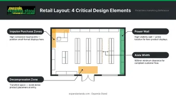
Key Elements Every Retail Floor Plan Needs
Layout type is the skeleton. These elements are what make it functional.
Decompression Zone
The first 5–15 feet inside the entrance is where shoppers slow down, adjust to the environment, and get their bearings. Products placed here are consistently overlooked. Retail researcher Paco Underhill called this the "landing strip" — shoppers stepping in from the street are still adjusting their pace and attention before they're ready to engage with merchandise.
Keep this zone open. Use it for orientation (store maps, category signage), not for high-value product placement.
Power Wall
Most shoppers drift right upon entering a store. The right-hand wall — often called the "power wall" — gets the most attention in those first moments of browsing. Place hero products, seasonal promotions, or bestsellers here. It's the highest-visibility real estate in the store.
Traffic Flow and Aisle Width
Congestion kills sales. Accessibility guidelines and retail best practices both point to a minimum clear aisle width of 900 mm, with adequate passing space at regular intervals. Research published in PMC confirms that fixture-induced aisle crowding directly depresses in-store sales.
Aisle width is also a merchandising lever. Wider aisles slow traffic; narrower aisles accelerate it. Match your aisle strategy to your retail goals.
Impulse Purchase Zones
High-traffic areas near checkout counters and along the path to destination products are prime locations for low-cost, high-margin impulse items. Fixture selection here is critical — units must be visible, easy to shop, and sized for the product.
Expanda Stand's Cashier Gondolas are designed specifically for checkout queue areas, making use of dwell time when customers are stationary. Their Side Kick / Power Wing units attach to existing gondola runs, adding secondary display points mid-aisle without narrowing the walkway.
Signage and Visual Merchandising
Clear wayfinding signs reduce customer frustration and help shoppers find what they came for — which means they stay in the store longer. Visual merchandising (strategic lighting, colour blocking, product grouping) draws attention to key items and reinforces brand identity.
Good signage gets customers to the right aisle; visual merchandising makes them stop and pick something up. Neither works as well without the other.
A few practical principles for both:
- Place category signs at eye level and above aisle entries, not buried mid-shelf
- Use colour blocking to create visual anchors that break up long gondola runs
- Group complementary products together to encourage multi-item purchases
- Reserve prime-height shelf space (90–150 cm) for high-margin or featured items
How to Plan Your Retail Store Layout: A Step-by-Step Guide
Step 1 — Define Your Goals
Start with what you want the layout to achieve beyond basic sales. Common goals include:
- Increasing average basket size
- Reducing shrinkage through better sightlines
- Promoting a hero product or new category
- Accommodating high foot traffic during peak hours
Your layout decisions should serve these goals directly. Without clear goals, every fixture placement becomes guesswork.
Step 2 — Audit Your Space
Before committing to any layout, measure everything:
- Total floor area
- Fixed infrastructure: columns, exits, electrical points, plumbing
- Back-of-house and storage requirements
- Natural light sources and lighting infrastructure
The ratio of selling space to back-of-house space varies by retail format — there's no universal benchmark, but every square metre given to storage is a square metre not generating revenue. Know your constraints before you design.
Step 3 — Map the Customer Journey
Trace the likely path a customer takes from entrance to checkout. Identify:
- Natural stopping points and browsing zones
- Potential dead zones where traffic drops off
- High-visibility positions worth premium product placement
Foot traffic observation, in-store heat maps, and time-lapse footage are practical tools for this. Even a few hours of observation on a busy trading day reveals patterns that will reshape your floor plan decisions entirely.
Step 4 — Choose Your Layout and Select Fixtures
Once you've chosen a layout type, fixtures must match it:
| Layout Type | Fixture Requirements |
|---|---|
| Grid | Gondola shelving, end caps, perimeter wall bays |
| Loop / Racetrack | Directional island units, perimeter wall fixtures |
| Free-Flow | Modular freestanding units, display tables, slat wall panels |
| Spine / Straight | Double-sided gondola runs, wall-mounted bays |
| Mixed | Combination of above based on zone function |
Working with a fixture manufacturer that offers custom solutions at scale matters here. Expanda Stand has completed 5,000+ retail projects across India, the USA, and Australia. Their in-house sheet metal fabrication — laser cutting, CNC punch pressing, powder coating — means fixtures are built to your exact space specifications.
Step 5 — Test, Measure, and Iterate
Implementation is just the starting point. Once the store is trading:
- Track sales data by zone to identify underperforming areas
- Monitor foot traffic patterns — where do customers go, and where don't they?
- Rotate displays regularly to keep the store fresh
Tool-free assembly gondola systems and modular freestanding units — like those Expanda Stand manufactures — support reconfiguration without significant downtime. Seasonal zone changes and product placement tests don't require a full store shutdown.
Retail Store Layout Tips to Maximise Sales
Three tactics that work regardless of which layout you choose:
Cross-merchandise complementary products. Place related items together — bread near spreads, phone cases near chargers, shoes near socks. This lifts average transaction value and reduces the effort customers need to complete a purchase.
Position destination products strategically. Items customers specifically seek out (staple groceries, popular medications) have drawing power. Placing them toward the rear of the store pulls customers through more floor space and increases exposure to other products along the way.
Keep your layout flexible. Seasonal promotions, new arrivals, and shifting consumer behaviour all demand periodic reconfiguration. Modular fixtures that rearrange without tools let you adapt quickly and without significant cost.
Frequently Asked Questions
What is a retail store layout?
A retail store layout is the planned arrangement of products, fixtures, aisles, and open space within a store, designed to guide customer movement and influence purchasing decisions. It determines what shoppers see, where they stop, and how much of the store they explore.
What are the types of retail store layouts?
The main types are grid, loop/racetrack, free-flow, spine/straight, herringbone, and mixed/boutique layouts. The best choice depends on your store size, product range, target customer, and the shopping experience you want to create.
How does store layout affect sales?
Layout controls how much of the store customers see, where they linger, and how easily they discover products. A well-planned layout increases impulse purchases, reduces frustration, and improves dwell time — all of which translate directly into higher sales.
What is the most common retail store layout?
The grid layout is the most widely used, particularly in supermarkets, pharmacies, and hardware stores. It maximises display space, is intuitive to navigate, and makes restocking straightforward.
How do I choose the right layout for my store?
Consider your product range, store dimensions, target customer, and the shopping experience you're aiming for. Visiting comparable stores before finalising your design helps — seeing how customers actually move through a similar space tells you more than any floor plan on paper.
What fixtures are needed for different retail layouts?
Each layout calls for different fixtures: grid layouts use gondola shelving and end caps, free-flow layouts use modular freestanding units and display tables, and loop layouts use directional island fixtures. Custom-manufactured fixtures are the best fit for stores with non-standard dimensions or specialist merchandising needs.