Introduction
Walk into a well-designed store and something clicks immediately — products feel easy to find, the atmosphere pulls you in, and before you know it, you've spent more time (and money) than planned. Walk into a poorly designed one and you leave within minutes, often without buying anything.
Physical retail remains the dominant channel globally — in India alone, brick-and-mortar stores account for over 88% of total retail sales, with organized retail continuing to expand across Tier 1 and Tier 2 cities. That's an enormous opportunity. But it's only available to retailers who understand one hard truth: shoppers form a judgment about a store within the first few seconds of entering.
Research consistently shows first impressions form in as little as 7 seconds, and poor store aesthetics rank among the top reasons customers don't return.
This guide covers the core principles of store design, the most effective layout types, how visual merchandising and display fixtures translate theory into sales, and practical ideas for the modern retail environment — all aimed at helping retailers increase dwell time, basket size, and conversion rates.
Key Takeaways
- Store design guides customers through a space in ways that maximise dwell time, engagement, and purchase rates
- Core principles: customer flow, visual hierarchy, brand consistency, and intentional use of space, light, and colour
- Layout type — grid, free-flow, or loop — is the foundation all other design decisions build on
- Display fixtures and visual merchandising translate design principles into measurable sales behaviour
- Experiential elements and in-store technology drive higher engagement and repeat visits
Core Principles of Store Design
These principles are the foundational rules behind every design decision — from floor plan to fixture finish. Ignoring them creates spaces that confuse or disengage shoppers before they've had a chance to buy anything.
Customer Flow and Navigation
A store's design should guide customers naturally, reducing decision fatigue at every turn. Two well-documented behavioural patterns shape this:
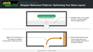
- The decompression zone: The first 1–3 metres inside the entrance. Shoppers are adjusting to the new environment here — mentally and physically — and product placed in this zone is consistently overlooked. Keep it clear.
- The right-turn tendency: Studies on retail traffic flow confirm that the majority of shoppers instinctively turn right upon entering a store. Smart retailers place high-margin or brand-defining products along that initial right-hand path.
Clear wayfinding — aisle markers, overhead signage, floor cues — reduces shopper frustration, extends dwell time, and increases unplanned purchases. Shoppers who can navigate confidently spend more time on the floor — and more time usually means more purchases.
Visual Hierarchy and Focal Points
Stores use height, position, and visual contrast to direct the customer's eye:
- Hero products at adult eye level
- Impulse items clustered near the checkout counter
- High-margin or seasonal products positioned at store entry points
- "Anchor displays" — oversized or striking visual arrangements — that serve as landmarks orienting customers within the space
Contrast in fixture height and product presentation creates visual rhythm. When every shelf sits at the same height and every bay looks identical, shoppers disengage faster — dwell time drops and so do basket sizes.
Brand Consistency
Every physical element — fixture materials, colour palette, signage, lighting tone — communicates brand identity. A discount retailer and a premium boutique may carry similar products, but their store design sends entirely different signals about price, quality, and trust.
Consistency across locations matters most for chain retailers. When a customer walks into any branch and immediately recognises the environment, that familiarity builds trust — and trust increases the likelihood of return visits.
Balance Between Density and Negative Space
Research published in the Journal of Retailing and Consumer Services found that overcrowded retail environments increase shopper confusion and reduce purchase confidence. The tension between maximising product display and avoiding visual overwhelm is real.
The resolution is intentionality:
- Premium and luxury retailers use open space deliberately — it signals quality and exclusivity
- Value-focused retailers use higher density — it signals selection and affordability
- Both approaches work when the density level is a deliberate choice, not a consequence of poor planning
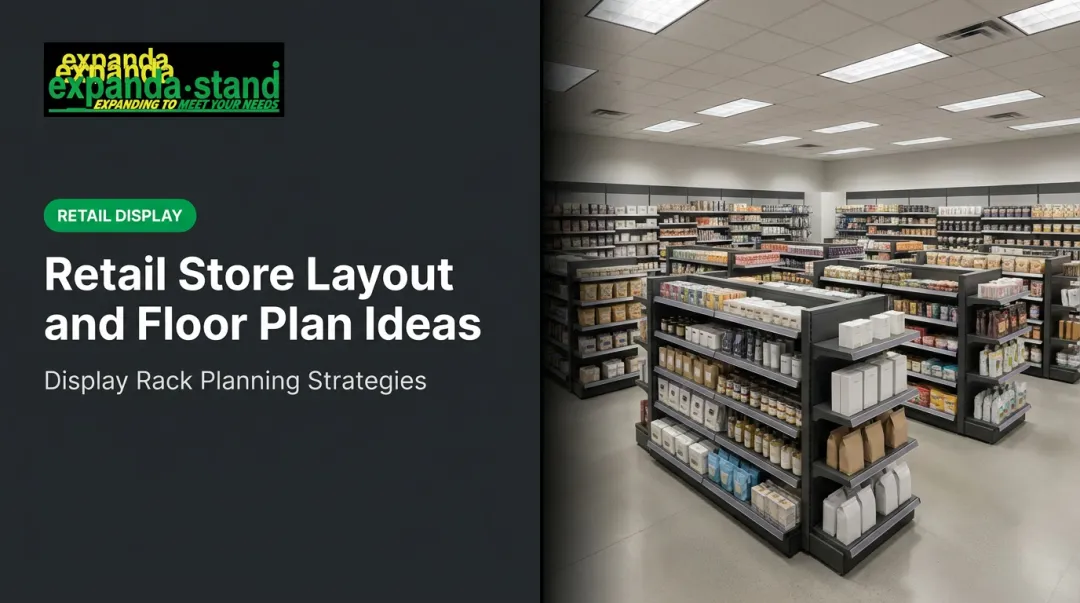
Types of Retail Store Layouts
A store's floor plan is the skeleton of its entire design. It determines how customers move, what they encounter, how long they stay, and what ends up in their basket.
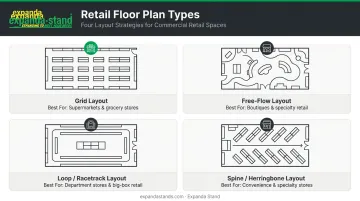
Grid Layout
Parallel shelving arranged in predictable rows. This maximises product density and enables efficient, goal-oriented navigation. Shoppers who arrive knowing what they want can find it quickly and move on.
Best for: Supermarkets, pharmacies, hardware stores, hypermarkets
The grid is the default choice when shoppers arrive with a purchase list. Speed and organisation matter more than discovery.
Free-Flow Layout
No fixed aisles — customers wander organically through the space. This suits environments where browsing and discovery are the goal, product density is lower, and per-item margins are higher.
Best for: Boutiques, apparel retailers, lifestyle and specialty stores
The trade-off is lower product capacity per square foot, which is why free-flow only works financially in higher-margin retail contexts.
Loop (Racetrack) Layout
A single defined path routes customers around the store's perimeter. Every customer passes every product section — maximising exposure without the rigidity of a grid.
Best for: Medium-to-large format retailers seeking a controlled customer journey, department stores, large specialty retailers
Spine and Herringbone Layouts
These are practical solutions for narrow or long store footprints: a central spine runs the length of the store, with branching aisles extending off either side. The herringbone variant angles those branches for improved visibility and traffic flow.
Best for: Convenience stores, long narrow retail units, strip-mall formats
Layout choice comes down to four variables: store size, product category, target shopper behaviour, and whether purchases are planned or impulse-driven. Match the layout to those factors first — everything else follows from there.
Visual Merchandising and the Power of Display Fixtures
Visual merchandising is the art of presenting products in ways that trigger purchase decisions. It sits at the intersection of psychology, brand storytelling, and spatial design — and it's where store design principles become tangible.
Product Placement Strategy
The "eye-level is buy-level" principle is one of retail's most reliably documented findings. Research and industry data consistently confirm that products placed at adult eye level on shelving units significantly outperform those positioned at the top or bottom of the same bay.
The high-conversion positions in any store follow a predictable pattern:
- Power walls (entrance-facing walls): Brand impact and hero products
- End caps (aisle ends): Impulse purchases and promotional items
- Checkout zones: Last-minute add-ons with high margin
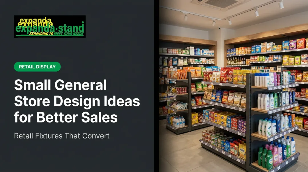
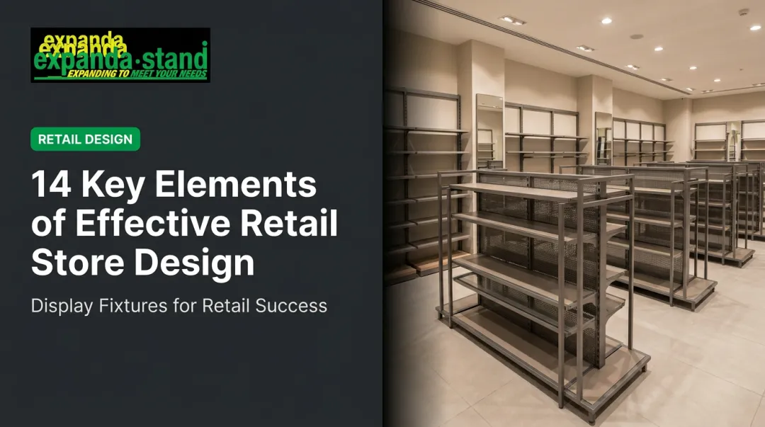
The Role of Display Fixtures
Fixture selection is a core design decision, not an afterthought. The right type depends on brand positioning, product category, and traffic density:
| Fixture Type | Best Application |
|---|---|
| Gondola shelving | Supermarkets, hypermarkets, grid-layout retailers |
| Wall-mounted systems | Space-efficient display, boutique side walls |
| Pegboard / perforated panels | Hardware, variety, accessories retail |
| Freestanding display units | Promotional zones, free-flow environments |
| Countertop displays | Checkout impulse, small high-margin items |
Modular fixture systems let retailers reconfigure layouts for seasons or promotions without the cost of a full store reset. Systems built around tool-free assembly — like Expanda Stand's gondola shelving, slatwall units, and perforated rack ranges — mean store managers can adapt layouts without specialist labour or equipment. ISO 9001:2015 certified manufacturing keeps components interchangeable and dimensionally consistent through repeated reconfigurations.
Window Displays and the Entrance Experience
The window display and store entrance are a brand's silent salesperson. Within seconds of passing, a potential customer forms an impression of what's inside — the product range, the price point, the brand personality.
A well-designed entrance experience:
- Communicates a clear seasonal or promotional story
- Creates curiosity without revealing everything
- Transitions the shopper from street pace to browse pace
Wall-mounted systems and slatwall units with integrated signage channels work well here — they deliver visual impact while allowing quick seasonal updates without dismantling the entire display.
Lighting, Colour, and the Sensory Dimension
Lighting
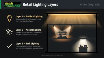
Retail lighting operates across three layers, each with a distinct job:
- Ambient lighting: General illumination — the baseline that determines overall atmosphere
- Accent lighting: Spotlights directed at specific products or displays, creating hierarchy and drawing the eye
- Task lighting: Practical illumination at checkout counters, fitting rooms, and service points
Research published in the Journal of Environmental Psychology links lighting conditions directly to retail impression and customer dwell time. Brighter, warmer lighting in product zones increases perceived product quality and purchase confidence. Yet lighting remains one of the most underspent areas in retail fit-outs, despite its direct effect on how customers perceive and interact with products.
Colour Psychology
Colour influences mood and behaviour before a customer consciously registers it:
- Warm colours (red, orange, yellow): Create urgency, stimulate impulse buying, increase arousal
- Cool colours (blue, green): Encourage browsing, convey trust and calm
- Neutral backgrounds (white, grey, natural tones): Keep focus on the products themselves without visual competition
One important caveat: colour must be brand-aligned before it's used psychologically. A brand built on calm and quality shouldn't introduce red urgency signals — the conflict undermines both the promotion and the brand.
Beyond Sight: The Multi-Sensory Store
Background music tempo, ambient scent, and in-store temperature all contribute measurably to the shopping experience. Studies on multi-sensory retail environments show that congruent sensory cues — where music, scent, and visual design reinforce the same brand mood — increase dwell time and average spend compared to single-sense environments.
Slow-tempo music extends dwell time; a brand-aligned scent increases browsing duration. Neither requires significant investment relative to the measurable lift in customer behaviour both consistently deliver.
Store Design Ideas for the Modern Retail Environment
Technology Integration
Technology in retail isn't about novelty — it's about reducing friction and capturing useful data. Practical touchpoints gaining traction across Indian and global retail include:
- Electronic shelf labels (digital price tags): Enable real-time price updates without manual labour
- QR codes on fixture panels: Link to product reviews, specifications, or brand content
- Self-checkout solutions: Reduce queue times and free staff for higher-value customer interactions
- In-store analytics: Camera and sensor systems that map traffic flow and identify underperforming zones
These tools work best when integrated into the fixture design from the start — cable management, power access points, and display rail compatibility matter when fitting technology into an existing store layout.
Experiential and Community-Focused Spaces
Many retailers are converting portions of their floor space into experience zones that give customers a reason to stay longer — and return more often. Common formats include:
- Product demonstration areas where customers try before they buy
- Workshop or tutorial spaces tied to the product category
- Café corners or seating arrangements that encourage browsing
- Community noticeboards and local-interest displays
These additions build visit frequency and brand loyalty that online competitors cannot easily replicate.
Sustainable Store Design
Sustainability has become both an ethical requirement and a brand differentiator. Practical applications include:
- Energy-efficient LED lighting systems (significant cost savings over time alongside reduced environmental impact)
- Modular fixtures designed for reconfiguration rather than disposal during store resets — Expanda Stand's gondola and wall rack systems are specifically built for repeated reconfiguration, extending fixture lifespan and reducing waste
- Communicating sustainability choices in-store through signage and material transparency, which resonates strongly with value-conscious shoppers
Frequently Asked Questions
What are the principles of store design?
The core principles are customer flow and navigation, visual hierarchy, brand consistency, effective use of space, lighting, colour, and fixture flexibility. Applied together, they guide shoppers logically through the space and reduce friction at every point in the purchase journey.
What are the 7 P's of retailing?
The 7 P's are Product, Price, Place, Promotion, People, Process, and Physical Evidence. Store design directly shapes "Place" and "Physical Evidence", which means it translates brand strategy into something shoppers can physically experience.
What are the different types of retail store layouts?
The four primary layouts are grid, free-flow, loop/racetrack, and spine/herringbone. The right choice depends on store size, product category, and whether target customers are mission-driven shoppers or discovery-oriented browsers.
How does store design affect customer behaviour?
Store design influences how long customers stay, how many products they encounter, and how confident they feel making a purchase. Layout determines product exposure. Lighting and visual merchandising shape mood and drive purchase completion.
What is visual merchandising and why does it matter?
Visual merchandising is the strategic presentation of products to drive purchase decisions, encompassing product placement, fixture selection, window displays, and signage. Done well, it directly lifts both conversion rates and average transaction value.
How important is lighting in retail store design?
Lighting is one of the most impactful design investments in retail. It defines atmosphere, draws attention to key products, guides movement through the store, and directly influences how shoppers feel and whether they complete a purchase.