Introduction
Walk into a poorly designed store and you'll feel it before you consciously notice it — cramped aisles, confusing layout, products that are hard to find. You're out the door in three minutes, empty-handed.
Walk into a well-designed one and the opposite happens. You discover products you weren't looking for, you stay longer, and you spend more.
This isn't coincidence. POPAI's 2014 Mass Merchant Shopper Engagement Study found that 82% of mass-merchant purchase decisions were made in-store, with 62% of purchases being unplanned. The store environment itself drives those decisions — not pre-trip planning.
Meanwhile, Deloitte's retail analysis reports that 80% of shopping still happens in physical stores, and nearly two-thirds of consumers prefer to see and touch items before buying. With e-commerce a tap away, what keeps shoppers choosing your store is the experience they can't get online.
This guide breaks down the 14 key elements that make retail store design effective — what each does, why it matters, and how to prioritise them for your specific store.
Key Takeaways
- Retail store design combines layout, fixtures, lighting, and atmosphere to guide customer behaviour and increase dwell time and basket size
- 82% of purchase decisions happen in-store — design directly determines what customers notice and buy
- The 14 elements covered here span floor plan, decompression zone, lighting, colour, fixtures, and checkout design
- Not every element carries equal weight — prioritise based on your store format, product category, and customer type
- Reconfigurable fixture systems let you refresh layouts seasonally without replacing your entire store setup
What Is Retail Store Design?
Retail store design is a multidisciplinary practice combining architecture, interior design, visual merchandising, ergonomics, and branding to create an environment that guides customers, showcases products, and reinforces brand identity.
Every element — fixture placement, aisle width, lighting angle, ceiling height — directly affects whether a shopper browses, buys, or walks out. It is not an aesthetic exercise. It is a commercial one. The 14 elements below determine how well your store does each job.
Why Store Design Directly Affects Sales
Most purchase decisions aren't made before customers arrive. They're made on the floor, shaped by what they see, how comfortable they feel, and how easy it is to find and evaluate products.
When design fails, the chain of negative outcomes is predictable:
- Cluttered entry zones overwhelm customers at the moment of transition
- Poor product visibility means items go unnoticed — and unsold
- Congested aisles shorten visits and reduce browsing
- Weak brand cues create uncertainty about price point and product quality
- Confusing navigation triggers early exits
The store environment shapes every one of these outcomes. Get these variables right, and customers browse longer, find products more easily, and convert more often — which is exactly what the 14 elements below are designed to help you achieve.
The 14 Key Elements of Effective Retail Store Design
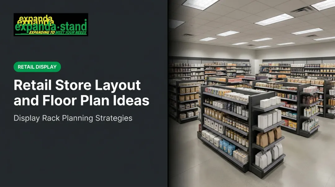
Element 1: Store Layout and Floor Plan
The layout is the foundation. It determines how customers move, which products they encounter, and how long they stay.
The main layout types and their best-fit formats:
| Layout Type | Best For | Key Benefit |
|---|---|---|
| Grid | Supermarkets, pharmacies, hardware | Maximum product density, efficient navigation |
| Loop/Racetrack | Apparel, lifestyle stores | Forces full product exposure |
| Free-flow | Boutiques, luxury retail | Encourages exploration and browsing |
| Spine | Large-format stores | Central aisle with departments branching off |
| Forced-path | IKEA-style destinations | Complete journey control |
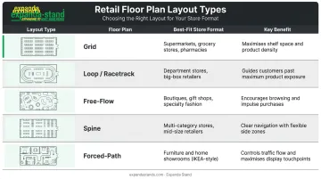
Choosing the wrong layout for your store type is one of the costliest design mistakes — it affects every other element's performance.
Element 2: Storefront and Exterior Design
The storefront communicates brand positioning before anyone steps inside. Display windows, exterior signage, and entrance visibility collectively set expectations for price point, product type, and brand personality.
Luxury retailers use restraint and space in window displays to signal exclusivity. Value-focused stores use density and bold signage to communicate deals. Neither approach is wrong — but the exterior must accurately represent what's inside. Mismatched signals erode trust before the shopping journey begins.
Element 3: The Entrance and Decompression Zone
The decompression zone — typically the first 5–15 feet inside the entrance, as identified by shopper research firm Explorer Research — is where customers are psychologically transitioning from the outside world. They are not yet ready to engage with merchandise or messaging.
Placing promotional products or key signage in this zone is one of the most common mistakes in retail design. Customers routinely walk past without registering them.
What the decompression zone should contain instead:
- Open space that signals a transition
- Strong brand-immersive visual anchors (materials, lighting, brand palette)
- Sensory welcome cues (scent, music level, temperature shift)
- A clear sightline into the store that draws the eye forward
Element 4: Customer Flow and Traffic Pathways
Most shoppers in markets like India, North America, and Australia tend to move anticlockwise through a store, following natural movement patterns that store designers can deliberately use. High-margin and featured products belong in the first high-attention zones of that path.
Equally important: aisle width. Consumer behaviour researcher Paco Underhill documented the "butt-brush effect" in Why We Buy — shoppers abandon browsing when aisles are narrow enough that they risk being bumped from behind. Adequate aisle width isn't just a comfort consideration. It directly protects dwell time and conversion.
Element 5: Lighting Design
Retail lighting has two simultaneous jobs: functional (clear product visibility, comfortable navigation) and atmospheric (directing attention, shaping mood).
Three lighting tiers every retail environment needs:
- Ambient/general lighting — baseline illumination for the full space
- Accent/feature lighting — directed light on key merchandise to draw the eye
- Task lighting — operational areas like checkout and stock rooms
The behavioural evidence is strong. A 2004 ACEEE study of 73 California retail stores found that daylighting was associated with a modelled average sales impact of 1–6% across store chains. Separately, Summers and Hebert's 2001 research found that supplemental display lighting increased time at display, items touched, and items picked up among 2,367 observed shoppers.
Bright, even lighting creates energy suited to high-volume stores. Layered or softer lighting creates intimacy suited to luxury and speciality formats.
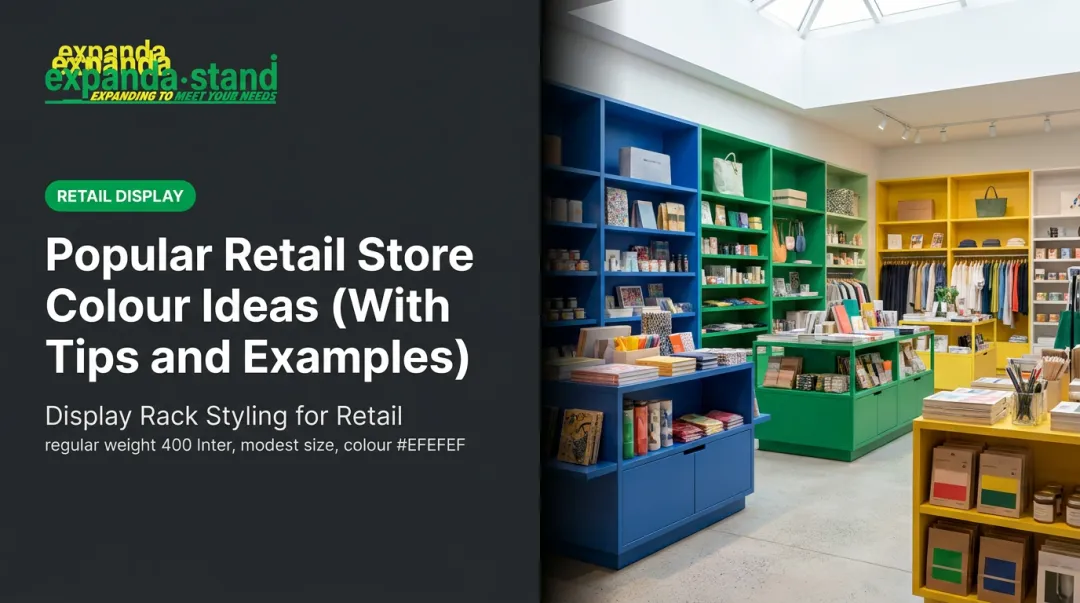
Element 6: Colour Psychology and Visual Aesthetics
Colour acts fast. Research published in Management Decision (Singh, 2006) found that people make assessments within 90 seconds of initial interactions, with 62–90% of that assessment based on colour alone.
Practical colour guidance for retail:
- Warm tones (red, orange) — create urgency and excitement; effective in impulse zones and promotional areas
- Cool tones (blue, green) — calming and trust-building; suited to considered-purchase categories like pharmacy and electronics
- Neutral backgrounds (white, grey, beige) — let merchandise be the visual focus; work across most formats
The key rule: interior colours must complement the product range, not compete with it. Your walls and fixtures should be a backdrop, not a visual rival.
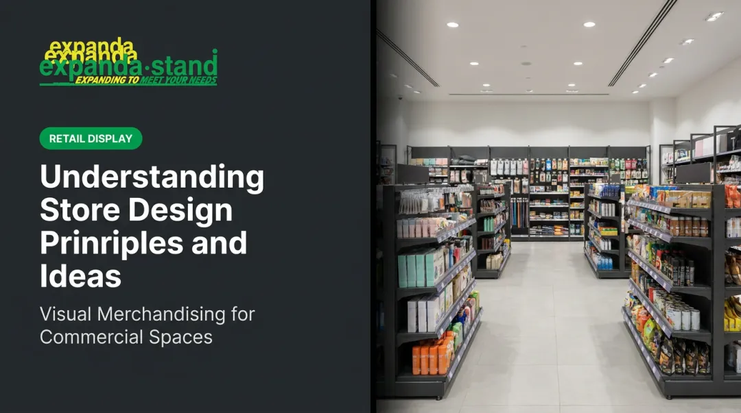
Element 7: Store Fixtures and Shelving Systems
Fixtures are the physical backbone of a retail environment — they determine product capacity, presentation height, sight lines, and how easily customers can browse and pick up products.
Fixture sizing must match both the space and the store format:
- Large-format stores (supermarkets, hypermarkets): taller, denser fixtures maximise capacity
- Boutique and premium formats: lower-height fixtures create open sight lines and a more premium feel
- Pharmacy environments: glass-shelf fixtures with adjustable heights support both display quality and product accessibility
Expanda Stand's gondola and wall shelving systems are built specifically for high-SKU retail environments, with adjustable shelves at 50mm pitch increments, tool-free assembly, and Tegometall-compatible modular designs. For pharmacies, its glass-shelf CSD systems offer 8mm toughened glass shelves with top storage cabinets — combining display quality with functional organisation.
Critically, modular fixture systems allow stores to reconfigure layouts for seasonal changes and category shifts without replacing entire setups — a significant cost and operational advantage.
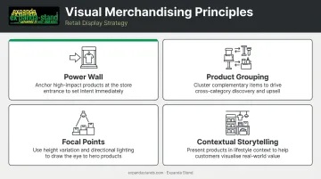
Element 8: Visual Merchandising and Product Displays
Visual merchandising is the strategic presentation of products to attract attention, communicate value, and trigger purchase decisions. A 2022 systematic literature review in the Journal of Business Research confirmed the close relationship between visual merchandising and broader store atmospherics in driving shopper behaviour.
Key principles:
- Power wall — the display surface most visible from the entrance (typically to the right) is prime real estate for hero products, new arrivals, or high-margin lines
- Product grouping — related items displayed together encourage cross-selling
- Focal points — use height variation, lighting contrast, and colour to direct the eye
- Contextual storytelling — showing products in use (a complete outfit, a recipe spread, a room setup) drives higher engagement than isolated product-only displays
Element 9: Signage and Wayfinding
In-store signage does two distinct jobs: navigational (helping customers find departments, categories, and checkout) and promotional (drawing attention to offers and new arrivals). Both are necessary.
Research by Otterbring et al. (2014) confirmed that in-store signage meaningfully affects customers' visual attention during navigation and decision tasks — though effectiveness varies based on store familiarity.
Practical signage requirements:
- Visual consistency with brand identity across font, colour, and tone
- Clear hierarchy: navigational signage takes priority over promotional
- Modular or frame-based systems that allow staff to update promotions without external support
Expanda Stand's wall unit and gondola systems include integrated top header signage and subheader systems, allowing retailers to update promotional content without specialist tools or outside installation.
Element 10: Store Atmosphere — Music, Scent, and Temperature
What customers hear and smell shapes how long they stay and how they feel about products — even when they're not consciously aware of it.
The evidence here is well-established:
- Music tempo: Milliman's 1982 Journal of Marketing study found that background music tempo significantly affects the pace of supermarket shopper traffic — slower music slows shoppers down, increasing dwell time
- Ambient scent: Chebat and Michon's 2003 research found that ambient odours affect shoppers' perceptions of both the retail environment and product quality, with those perceptions mediating spending behaviour
Atmosphere choices must match the brand and audience. A lingerie boutique and a hardware store require fundamentally different sonic and olfactory environments. Temperature is also a genuine design parameter — an uncomfortably hot or cold store shortens visits, regardless of how well everything else is designed.
Element 11: Branding and Store Identity
Effective store design makes the brand tangible. Materials and finishes communicate brand positioning without a word:
- Raw concrete and steel → industrial, urban, independent
- Warm timber and natural textures → organic, wellness, natural product focus
- Polished surfaces and minimal fixtures → premium, tech, luxury
Brand consistency across the exterior and interior builds customer trust, reinforces recall after the visit, and creates genuine differentiation in competitive retail environments. For multi-location retailers, the challenge is maintaining brand uniformity across stores while allowing for meaningful local adaptation.
Element 12: Checkout Zone Design
The checkout zone is the final brand touchpoint, and it serves two purposes simultaneously:
- Frictionless transaction — clear queue management, accessible payment, ergonomic counter design
- Incremental purchase capture — strategically placed small, low-cost items within reach of waiting customers
The checkout should sit at the natural conclusion of the customer's journey — typically to the left of the entrance in a loop layout. Its design communicates the last impression customers leave with.
Expanda Stand manufactures Cashier Gondolas and Side Kick/Power Wing units specifically engineered for checkout-zone impulse placement, alongside full checkout counter systems with integrated cable management, cash drawer compatibility, and collision protection.
Element 13: Space Zoning and Utilisation
Space zoning divides a store into distinct product or experience areas. Done well, it helps customers navigate intuitively while giving different categories their own atmosphere and emphasis.
Zone definition techniques that don't require permanent barriers:
- Floor material changes — tile to timber, or colour transitions
- Ceiling height variation — lowered ceilings create intimacy; higher ceilings signal openness
- Lighting shifts — different colour temperatures or intensity levels per zone
- Freestanding gondolas and island units — create aisle structure and visual separation
In large-format stores, zones prevent the overwhelming effect of undifferentiated space. In smaller stores, smart zoning creates the perception of more space and cleaner organisation. Expanda Stand's island gondola systems and corner rack units are specifically designed as non-permanent zone-defining fixtures.
Element 14: Flexibility and Adaptability
A store that cannot change cannot stay relevant. Seasonal rotations, new category additions, promotional resets, and shifting customer preferences all require a layout and fixture system that can be reconfigured cost-effectively.
Key design decisions that enable flexibility:
- Modular fixture systems with tool-free reconfiguration
- Adjustable shelf heights (50mm pitch increments allow precise changes)
- Interchangeable signage frames for promotional updates without external support
- Neutral base aesthetics that accommodate seasonal colour overlays
- Freestanding, non-permanent zone dividers
Flexibility is an investment decision, not an afterthought. Stores that build adaptability in from the start spend significantly less on future resets and avoid the disruption of full fixture replacements.
How to Prioritise These Elements for Your Store
Not all 14 elements carry equal weight for every format. A supermarket's priorities (density, navigation efficiency, flow) differ fundamentally from a boutique's (atmosphere, brand storytelling, tactile experience).
A practical three-layer prioritisation framework:
- Non-negotiables — Layout, customer flow, lighting, and fixtures affect every other element's performance. Get these right first.
- Brand differentiators — Atmosphere, visual identity, signage, and display design are shaped by what your target customer expects from the experience.
- Operational longevity — Modular signage and reconfigurable fixtures keep the store commercially effective over time, without repeated full redesigns.
Identify the 2–3 elements with the greatest impact on your store format and invest disproportionately there. Spreading budget evenly across all 14 elements produces mediocre results overall.
Common Retail Store Design Mistakes to Avoid
Three mistakes that consistently cost retailers revenue — and are easy to avoid once you know what to look for:
Overcrowding the decompression zone — placing promotional merchandise or signage in the first 10–15 feet of the store. Customers in transition mode walk past without registering it. Keep this area open.
**Prioritising aesthetics over customer flow** — even the most visually impressive store will lose customers if the aisles are congested and wayfinding is unclear. Shoppers who can't navigate comfortably don't stay long enough to buy. Function must come before decoration.
Choosing rigid, non-modular fixtures — permanent or highly specialised fixtures may look polished at launch, but they make seasonal resets expensive and slow. When product ranges shift or new categories arrive, inflexible fittings become a liability rather than an asset.
Conclusion
Effective retail store design is a system of 14 interconnected elements, not a single decision. Getting the fundamentals right — layout, flow, lighting, fixtures — creates the platform on which everything else builds.
The best-designed stores balance brand expression with operational practicality. They draw customers in, guide them through a purposeful journey, and make discovery and purchase effortless. When design decisions are driven by commercial intent — not just aesthetics — the result is a store that actively works harder for the business.
For retailers looking to execute on these elements, the right fixtures and display systems do much of the heavy lifting. Expanda Stand has been manufacturing custom retail display racks and store fixtures for over 25 years, helping stores across India translate design intent into functional, well-merchandised spaces.
Frequently Asked Questions
What are the 7 principles of retail?
The 7 principles are product, price, place, promotion, people, process, and physical evidence. Store design is most directly connected to "place" and "physical evidence" — the tangible environment that shapes how customers perceive and interact with everything else.
What is the 3-5-7 rule in interior design?
The 3-5-7 rule refers to grouping decorative or display objects in odd numbers (3, 5, or 7) to create visual interest and natural balance. In retail visual merchandising and window display design, odd-number groupings draw the eye more effectively than symmetrical, even-number arrangements.
What is the decompression zone in a retail store?
The decompression zone is the transitional area just inside the store entrance — typically the first 5–15 feet — where customers are still adjusting to the new environment. It should be kept free of key merchandise and promotional messaging, as customers in transition mode routinely miss both.
How does store design impact sales?
Store design shapes where customers look, how long they stay, and what they pick up — directly affecting dwell time, product discovery, and conversion. POPAI's research links well-designed environments to the 62% of purchases that are unplanned, by reducing browsing friction and maximising product exposure.
What is the most important element of retail store design?
Store layout and customer flow are typically the most foundational. They determine how every other element performs — a poorly planned floor plan limits the effectiveness of even the best lighting, fixtures, and displays, because customers never encounter them in the right context.
How often should a retail store be redesigned?
A full redesign typically makes sense every 3–5 years, while fixtures, signage, and display layouts should be refreshed seasonally or alongside major category changes. Modular fixture systems make incremental updates far less disruptive and more cost-effective than full replacements.