Most store owners invest heavily in inventory decisions and almost nothing in how that inventory is physically presented. That gap is where sales are quietly lost every day.
This article covers the highest-impact design changes you can make to your general store—layout selection, fixture choices, product placement, and ambiance—without gutting your budget or closing for a week-long renovation.
Key Takeaways
- Layout first: Grid layouts suit stores with broad SKU variety; spine layouts work better for narrow spaces.
- Go vertical: Wall-mounted and adjustable gondola shelving adds stock capacity without adding square footage.
- Place products deliberately: Essentials at the back draw customers through the store; impulse buys belong at checkout.
- Lighting and signage drive sales: Both directly affect how long customers stay and how easily they find products.
Why Store Design Is a Sales Strategy, Not Just Aesthetics
Research on grocery shopper behaviour found that customers visit only about 37% of store zones on a typical trip, yet unplanned purchases account for roughly 40% of their total shopping budget. That gap between what shoppers plan to buy and what they actually spend is where store design does its work.
The same research found that a 10% increase in a customer's in-store travel path was associated with 16.1% higher unplanned spending. The implication is direct: the more of your store a customer sees, the more they buy. Layout controls that exposure.
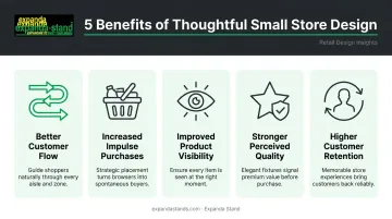
What Good Design Actually Delivers
For a small general store, thoughtful design produces measurable outcomes:
- Better customer flow — fewer dead ends, less backtracking, less frustration
- Increased impulse purchases — exposure to products customers didn't plan to buy
- Improved product visibility — more SKUs seen per visit
- Stronger perceived quality — a clean, organised store feels more trustworthy
- Higher customer retention — shoppers return to stores that feel easy to navigate
The Kirana-Specific Challenge
Indian kirana stores face a specific set of constraints: narrow floor plans, high SKU variety across unrelated categories, and frequent foot traffic from customers on quick errands. Every design decision carries more weight when you're working with 200–400 square feet. A poorly placed shelf actively shortens visits and reduces basket sizes — and those same constraints make small improvements disproportionately impactful.
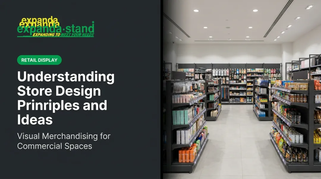
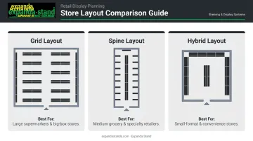
Choosing the Right Layout for Your Small General Store
Layout determines the customer journey before a single product is placed. Get it right and customers move naturally through more of your store. Get it wrong and they grab what they came for and leave.
The Grid Layout
The grid uses long parallel aisles running in the same direction. It's the most familiar format for shoppers and the most efficient for dense, varied inventory.
Best suited for: Stores with a large SKU count spanning multiple categories—staples, household products, personal care, snacks.
Key tactic: Place high-demand essentials (rice, oil, soap, sugar) at the back of the store. Customers heading to these anchors pass through other aisles on the way, increasing exposure to discretionary items. This consistently drives the highest volume of unplanned purchases in a general store layout.
The Spine (Straight) Layout
A single central aisle runs from the entrance to the back, with secondary shelving branching off on either side.
Best suited for: Narrow or elongated store formats where a full grid would create uncomfortably tight aisles.
A spine layout creates a clear navigation path that reduces confusion and keeps customers moving toward the back — where anchor products are typically stocked. It works especially well in stores under 400 sq ft where grid aisles would feel cramped.
The Decompression Zone
The first 5–10 feet inside your entrance is a transition space. Shoppers are still adjusting—pocketing keys, looking around, getting oriented. Products placed here are largely ignored.
Use this zone for:
- Store name and brand colour cues
- Basket and trolley placement
- Directional signage pointing shoppers toward key categories
- A clean, open visual that signals the store is well-organised
Avoid cluttering it with promotional displays or dense shelving. That prime placement is wasted here.
Quick Decision Guide
Not sure which layout fits your space? Use this as a starting point.
| Store Type | Recommended Layout |
|---|---|
| Wide floor plan, many unrelated categories | Grid |
| Narrow or elongated space | Spine |
| Very limited floor area | Hybrid: wall-mounted spine + one central gondola row |
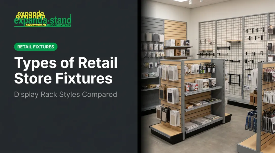
Smart Fixtures and Space Optimisation for Small Stores
Vertical Merchandising: Your Best Tool in a Small Store
When floor space is limited, the wall is your most underused asset. Wall-mounted shelving along all perimeter walls—floor to ceiling where practical—can dramatically increase stock capacity without touching your floor plan.
Expanda Stand's wall-mounted supermarket rack systems are built for exactly this application: modular, tool-free assembly, adjustable at 50mm pitch intervals, and compatible with a wide range of accessories. For a kirana or small general store, that adjustability matters — shelf heights can be reconfigured seasonally as product sizes and stock assortments change.
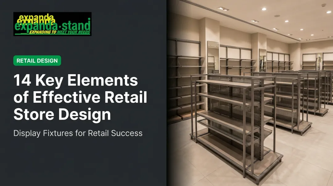
Gondola Units: The Workhorse of the Store Floor
Double-sided gondola racks placed centrally serve two purposes simultaneously: they create display space on both faces and naturally form the aisles that guide customer movement.
Placement strategy for gondola shelves:
- Eye level (4–5 feet): High-margin or promoted items
- Easy reach (waist to shoulder): Fast-moving essentials
- Top shelves: Slower-moving stock or backup inventory
- Bottom shelves: Bulk staples and heavy items
Expanda Stand's island/gondola shelving systems use powder-coated steel construction with tool-free assembly, giving small stores a structured aisle layout with clear sightlines on both sides.
End-Cap Displays: The Premium Retail Estate
The ends of gondola aisles are among the highest-visibility zones in any store. A peer-reviewed study of an Australian supermarket found that rear end-cap displays generated a 416% sales uplift compared to mid-aisle placement for featured products.
Rotate end-caps weekly or fortnightly with:
- Promotional bundles
- New arrivals
- Seasonal items (festival stock, monsoon essentials, harvest-season products)
Expanda Stand also manufactures side kick/power wing impulse racks that attach to gondola sides—a compact way to add high-visibility impulse display without taking up additional floor space.
Common Fixture Mistakes to Avoid
- Overcrowded aisles: Aisle width should allow two people to pass comfortably. Tight aisles cause customers to abandon browsing and leave early.
- Fixed shelving: Shelving that can't adjust to product height changes forces poor merchandising decisions across the board.
- Neglecting pegboards: Small items like batteries, stationery, and personal care accessories take up disproportionate shelf space. Wall-mounted pegboard racks with hooks free up shelf space for higher-value products.
Product Placement, Cross-Merchandising, and Impulse Buys
Zone Your Store Clearly
Create defined sections—groceries, household, personal care, snacks, beverages—using shelf-edge labels or colour-coded signage. This reduces decision fatigue, speeds up navigation, and prevents the sense of clutter that shortens visits.
Sequence zones logically so customers pass through complementary categories on the way to their primary destination. A shopper heading to the staples section should pass through snacks. Someone going to personal care should walk past household cleaning products.
Cross-Merchandising That Actually Works
Place related products together—it's convenient for customers and increases basket size naturally:
- Tea next to biscuits and sugar
- Cooking oil adjacent to spices and flour
- Cleaning products near sponges and gloves
- Baby products clustered with related items
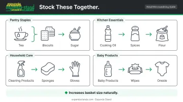
Rotate cross-merchandising pairings every few weeks. It keeps the store feeling fresh for regular customers and surfaces products they may have overlooked.
The Checkout Counter as an Impulse Zone
Customers waiting at the billing counter are stationary and receptive. Kantar research on kirana store behaviour finds that retailer-driven placement at the transaction zone consistently drives unplanned purchases. That makes the checkout counter some of the most productive square footage in the store.
Stock the checkout zone with:
- Low-cost snacks and confectionery
- Small personal care items (lip balm, hair clips, hand sanitiser)
- Batteries, lighters, and other small essentials
- Seasonal impulse items
Expanda Stand's cashier gondolas are designed to sit beside or behind the billing counter, keeping impulse stock accessible and the checkout area tidy. The compact checkout counter range includes integrated cable management and POS peripheral housing, so merchandising and point-of-sale functions share the space without crowding each other.
Eye-Level Placement Is Not Optional
Products at eye level—roughly 4–5 feet from the floor for adults—are purchased far more often than those on top or bottom shelves. Reserve these positions for:
- High-margin items you want to move
- Promoted products
- New arrivals you're introducing to regular customers
For products targeting children (small snacks, candies), position at their eye level, a placement that reliably influences what parents add to the basket.
Lighting, Signage, and Ambiance
Practical Lighting for a Small Store
A three-layer lighting approach works well for general stores:
- Ambient lighting — warm white LEDs (2700K–3000K) for overall store warmth; avoids the cold, clinical feel of fluorescent tubes
- Accent or spotlight lighting — directed at featured shelves, end-caps, or new arrival zones
- Fill lighting — strips for narrow aisles or corners that tend to go dim
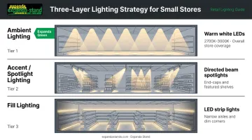
Peer-reviewed research confirms that colour and lighting are important retail design techniques used to attract customers and increase market opportunities. Practically, proper lighting reduces the perception of clutter, makes products appear more appealing, and keeps customers browsing rather than rushing.
Signage That Earns Its Place
Good in-store signage does two jobs at once: it helps customers find what they need faster, and it draws attention to deals and new products.
- Aisle headers for each product zone (Groceries, Household, Personal Care)
- Shelf-edge labels for pricing and promotional callouts
- End-cap signage highlighting what's featured and why
Use consistent fonts and your store's brand colours across all signage. Hand-written or chalk signage for daily specials adds a personal, local character that chain competitors genuinely can't replicate. Use it deliberately — it's a low-cost differentiator no chain store can copy.
Low-Cost Sensory Adjustments
Two small changes that most store owners overlook:
- Mild background music at low volume — decades of retail research consistently shows music tempo affects customer pace; slower music encourages shoppers to slow down and browse longer.
- Neutral entrance scent — avoid storing strong-smelling cleaning agents or produce near the entrance. First impressions at the door affect how long customers stay.
Both adjustments cost nothing to implement and work best when your layout and shelving are already optimised for browsing.
Frequently Asked Questions
What are the 4 types of store layout?
The four main types are grid (parallel aisles), loop/racetrack (a circular path), free-flow (open, unstructured), and spine/straight (one central aisle). For small general stores, grid suits wider spaces with varied inventory; spine works best for narrow or elongated formats.
What is an example of a general store?
A general store stocks a broad range of everyday essentials for a local community. In India, the most common examples are kirana shops, tapris, and corner stores that carry groceries, household products, personal care items, and snacks—typically serving a neighbourhood's daily needs.
What is the 3-5-7 rule in interior design?
The 3-5-7 rule recommends grouping display items in odd numbers (3, 5, or 7 units) to create visual balance that feels natural rather than symmetrical. Applied to a general store, this works well for themed shelf displays, promotional groupings, and end-cap arrangements.
What is the best layout for a small general store?
The right choice depends on your store's dimensions and product mix. If your floor plan is wide enough for two-person aisle clearance and carries multiple categories, grid works best. Narrow or elongated spaces benefit more from a spine layout with branching display sections.
How can I increase impulse purchases in my small general store?
Three tactics with the strongest evidence: place low-cost, high-margin items at the checkout counter; rotate end-cap displays with promoted or seasonal products; and position complementary items next to high-traffic staples so customers see add-on purchases naturally.
How does lighting affect sales in a retail store?
Warm, well-distributed lighting makes products more visually appealing and reduces the perception of clutter. Customers browse longer in well-lit stores—and longer browse time directly increases average basket size.