India's organised retail market is projected to reach US$230 billion by 2030, and with more store formats competing for the same shopper's attention, standing out on the floor has never mattered more.
This guide covers 17 actionable ways to display products in retail — from foundational fixture choices to experiential and technology-driven techniques — grouped into five practical categories you can apply immediately.
Key Takeaways
- Product displays are silent salespeople — placement, lighting, and grouping determine whether a shopper picks up a product or walks past.
- Research from the Journal of Retailing found that optimising display allocation across display types produced an average 11.15% revenue increase in studied retail environments.
- The 17 methods below cover five categories — from window displays and fixtures to experiential approaches and in-store technology.
- The best displays balance aesthetics with function — easy to navigate, visually cohesive, and refreshed regularly.
- No single display works for every store — match your approach to your product, shopper behaviour, and store format.
Why Product Displays Are a Retailer's Most Powerful Sales Tool
Most purchase decisions happen after a shopper enters the store. POPAI's 2014 Mass Merchant Shopper Engagement Study found that 82% of shopping decisions were made in-store across nearly 3,000 shoppers surveyed. That makes the in-store environment — particularly how products are presented — the last and most persuasive touchpoint in the path to purchase.
The Psychology Behind What You See
Visual merchandising works because it taps into how shoppers process their surroundings emotionally before they think analytically. Three principles drive this effect:
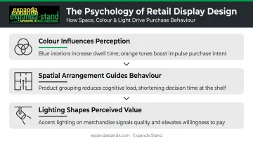
- Colour influences perception: Research published in the Journal of Business Research found that blue store interiors generated more favourable purchase intentions than orange interiors in fashion settings — a reminder that colour choices carry real commercial weight.
- Spatial arrangement guides behaviour: Products grouped thoughtfully reduce cognitive load, making it easier for shoppers to decide.
- Lighting shapes perceived value: Brighter, targeted accent lighting draws attention and signals quality.
Good display design is accessible at almost any budget. What matters most is understanding your shopper, choosing the right fixtures for your space, and executing with intent. The 17 methods below cover both the ideas and the practical steps to put them to work.
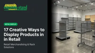
17 Creative Ways to Display Products in Retail
Window and Entryway Displays
Way 1 — Seasonal or Themed Window Displays
Rotating window displays around seasons, cultural moments, or promotional events create fresh visual interest that pulls foot traffic in before a shopper ever steps inside. A Diwali window, a summer-sale setup, or a back-to-school theme gives passersby a reason to pause — and reason enough to enter.
Retail consultant Bob Phibbs recommends refreshing storefront window displays monthly. That cadence keeps the store looking current to repeat visitors and signals an active, well-managed business.
Way 2 — Entryway "Decompression Zone" Displays
The first several feet inside any store entrance are where shoppers mentally shift from street mode to browsing mode. Retail researcher Paco Underhill, whose observational work at Envirosell shaped modern store layout thinking, found that shoppers need space to adjust before they engage. Merchandise placed too close to the door routinely goes unnoticed.
Use this zone for a single, high-impact display: new arrivals, a hero product, or an aspirational lifestyle piece. One clear visual statement works far better than a crowded product cluster.
Way 3 — Sidewalk-Facing Exterior Signage
A-frame signs, banner stands, or compact outdoor display units placed just outside the entrance function as teasers. They give a passerby a single, compelling reason to step in — whether that's a promotion, a new arrival, or a category hook.
Keep messaging to one clear, readable line. Passersby typically have two to three seconds to read it.
Fixture-Based Structural Displays
Way 4 — Gondola Display Units
Gondola units are the backbone of most organised retail stores. Their double-sided island configuration maximises product visibility from both sides of the aisle, making them particularly effective for supermarkets, hypermarkets, and large-format stores.
Expanda Stand's Island/Gondola Shelving systems feature tool-free assembly and Tegometall-compatible modular design, allowing retailers to reconfigure layouts for seasonal campaigns or new product categories without significant downtime. Adjustable shelf pitch and powder-coated steel construction make these units a long-term fixture investment.
Placement near checkout zones or high-traffic aisles amplifies their commercial impact.
Way 5 — Freestanding Display Units (FSDUs) and Dump Bins
Freestanding units placed mid-aisle or at aisle ends act as pattern interrupts — they stop shoppers mid-journey and encourage impulse purchases that weren't on the shopping list.
Dump bins work especially well for:
- Low-cost, high-volume items (accessories, snacks, seasonal products)
- Clearance and promotional merchandise
- Bulk items where tactile browsing is part of the experience
Expanda Stand's Promo Bins/Dump Bins include adjustable wire shelves, integrated signage systems, and custom branding options — designed specifically for high-traffic promotional zones.
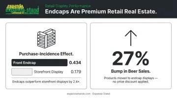
Way 6 — Endcap Displays
Endcap positions — the shelving at the end of each aisle — are premium retail real estate. Research in the Journal of Retailing found that front endcap displays had the largest measurable impact on category purchase among all display types studied, with a purchase-incidence effect of 0.434 for front endcaps versus 0.179 for storefront displays.
A separate study found that moving products to promotional endcap displays produced a 27% bump in beer sales even without any price discount attached.
Use endcaps for product launches, brand takeovers, or your highest-margin items.
Way 7 — Power Wall Displays
A power wall is a large, visually dominant wall display — typically positioned to a shopper's immediate right upon entry — dedicated to a brand's hero products or best-sellers. Done well, it creates an immediate first impression that sets the tone for the entire shopping visit.
Keep these three principles in mind:
- Replenishment: A poorly stocked power wall signals neglect and undermines perceived value
- Height range: Floor-to-ceiling configurations with adjustable shelf pitch give precise control at every level
- Finish: Material choice (powder-coated steel, stainless, wood/MDF, or toughened glass) should reflect the category and brand tone
Expanda Stand's Wall/End Supermarket Rack range is built for exactly this — floor-to-ceiling configurations with 50mm adjustable shelf pitch across multiple finish options, configurable for gondola, endcap, or full power wall setups.
Visual Design Techniques
Way 8 — Colour Blocking
Colour blocking groups products by colour family to create bold, eye-catching sections across a shelf or display. The benefits:
- Simplifies navigation — shoppers identify product families at a glance
- Creates visually memorable displays that perform well for categories like kitchenware, fashion, and stationery
- Reduces the "visual noise" that comes from mixed-colour arrangements
A straightforward example: grouping all white kitchen accessories together versus mixing white, black, and stainless-steel items. The colour-blocked version reads cleaner and more intentional.
Way 9 — Lifestyle Vignettes and Themed Scenes
A lifestyle vignette is a fully styled scene that shows a product in context. A complete dining table setup in a home goods store. A gym bag open with all its contents displayed nearby. A bedside table styled with the lamp, book, and mug you'd actually find there.
These displays help shoppers visualise the product in their own lives — which increases emotional connection and purchase intent. The investment is in styling, not necessarily in product cost.
Way 10 — The Rule of Three
Odd-numbered groupings attract the eye more naturally than even numbers. Groups of three, specifically, create visual tension that draws shoppers in rather than leaving the display feeling flat or overly symmetrical.
Applied to shelf arrangements: instead of four identical face-outs, try three products at slightly different heights or orientations. On a tabletop display, three items of varying scale create far more interest than two or four.
Way 11 — Multi-Level Height Variation
Varying the height of products within a display guides the eye across the entire presentation rather than stopping at a single plane. Flat, uniform shelf arrangements cause shoppers to disengage quickly because there's nothing dynamic to look at.
Height variation can be achieved through:
- Tiered fixtures and slanted shelving
- Risers and pedestals within a display
- Mixing packaging heights deliberately
Expanda Stand's Wall F&V Racks feature built-in slanted shelves with polished mirror positioning — a design specifically engineered to create this tiered, multi-level visual effect for fresh produce and similar categories.
Experiential and Sensory Displays
Way 12 — Interactive and Touchable Product Displays
When shoppers can handle, test, or experience a product directly, purchase intent increases. Research published in the Journal of Retailing confirmed that touching a product raises purchase intent and willingness to pay — provided the shopper has a clear mental picture of how they'll use it.
The Apple Store made this principle famous for electronics — but it applies equally to fashion (fabric samples and open garments), cosmetics (testers), hardware (tools mounted for handling), and many other categories. Open, accessible displays invite engagement in a way that sealed packaging simply cannot.
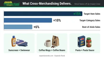
Way 13 — Cross-Merchandising Setups
Cross-merchandising places complementary products from different categories together to suggest complete solutions. Classic combinations:
- Sunscreen displayed alongside swimwear
- Coffee mugs adjacent to specialty coffee beans
- Pasta next to premium pasta sauces
A study across seven supermarket chains found that a cross-merchandising approach increased target-item sales by 15%, target-category sales by 10%, and rest-of-aisle sales by 6%. The goal is to expose shoppers to products they wouldn't have sought out independently — and to increase basket size by making the connection obvious.
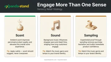
Way 14 — Sensory Engagement Beyond Sight
Memorable retail environments engage more than one sense. Three practical applications:
- Scent: Research from the Journal of Business Research found that ambient scent contributes to favourable perceptions of the shopping environment and indirectly improves perceived product quality. Use it subtly — overpowering scent alienates sensitive shoppers.
- Sound: Background music chosen to match brand identity influences pace, mood, and dwell time.
- Sampling: Where applicable, product tasting or trial creates direct experiential proof that removes purchase hesitation.
None of these require significant infrastructure. A diffuser, a curated playlist, and a sampling station can meaningfully shift the atmosphere.
Signage, Lighting, and Technology
Way 15 — Strategic Accent Lighting
Lighting is one of the most underutilised display tools in retail. Research by Summers and Hebert found that supplemental lighting treatments had a measurable positive effect on time spent at displays, items touched, and items picked up.
Two practical principles:
- Warm lighting (amber/yellow tones) creates an inviting, cosy atmosphere — well-suited to food, fashion, and home goods
- Cool/white lighting signals modernity and energy — appropriate for electronics, pharmacy, and sporting goods
Accent spotlights directed at hero products communicate premium value without a single word of copy.
Way 16 — Creative and Storytelling Signage
Effective in-store signage goes well beyond price tags. A single well-crafted sign that communicates a product's origin, a specific benefit, or a touch of personality can noticeably increase engagement — particularly for products where the story is part of the value (artisanal food, sustainable fashion, specialist tools).
Keep it to one sentence maximum. Make it legible at three metres. Print or produce it professionally — handwritten signs in anything other than a deliberately rustic context undermine perceived product quality.
Way 17 — Digital Screens and Technology Integration
A four-year study of 237 in-store digital signage campaigns analysed 30 million customer receipts and found an average 8.1% sales lift attributable to in-store digital screens. That's a substantial return for a display format that can be updated remotely without physical rework.
Practical applications in retail:
- Looping product videos at category entry points
- Rotating promotional messages in high-traffic zones
- QR codes embedded in physical displays that link shoppers to reviews, how-to content, or online purchase options
Digital screens reduce the need for frequent physical display overhauls while keeping content current.
How to Choose the Right Display Strategy for Your Store
The right display approach depends on three variables: the type of products being sold, the store format, and how your target shopper actually buys.
Different shopper types call for different setups:
- Convenience shoppers need immediate product accessibility and minimal friction — no hunting, no barriers.
- Considered-purchase buyers (boutiques, electronics) need context, product information, and room to explore before committing.
- Hypermarket shoppers respond to clear wayfinding, promotional endcaps, and bulk display cues.
Common Mistakes to Avoid
- Overcrowding shelves: Too much product on a display reduces each item's perceived value and overwhelms the shopper.
- Ignoring display fatigue: Repeat visitors stop seeing a display they've walked past 20 times. Refreshing monthly keeps the environment feeling active.
- Placing displays based on available space rather than traffic flow: Space convenience and shopper visibility are rarely the same thing.
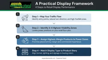
A Practical Framework
- Map your traffic flow — identify where shoppers enter, which direction they naturally turn, and which zones see the highest footfall.
- Identify your three to four highest-visibility zones — these are your power positions.
- Assign your highest-margin or most important products to those zones.
- Match the display type (fixture format, lighting, signage) to the product's story and the shopper's buying intent at that moment.
The only tools you need are observation, a floor plan, and a willingness to watch how customers actually move through your store. Most display problems become obvious once you do.
Conclusion
Great product displays aren't about spending the most — they're about understanding your shopper, telling a clear visual story, and placing the right product in the right location with the right fixture supporting it.
Treat displays as a living part of your retail strategy. Refresh them monthly, track which zones convert, and adapt as your customer base shifts. The stores that do this consistently outperform those that set up a display once and leave it unchanged for six months.
For retailers ready to bring these ideas to life, Expanda Stand has been manufacturing retail display fixtures since 1999 — completing 5,000+ projects across hypermarkets, supermarkets, pharmacies, and specialty stores. Their range covers gondola systems, endcap units, freestanding promotional displays, and power wall configurations, all designed and built to suit your store layout and category mix.
Reach out at sales@expandastands.com or call +91-44-26880800 to discuss a fixture solution built around your retail environment.
Frequently Asked Questions
What are the 5 R's of retailing?
The 5 R's are the Right Product, Right Place, Right Price, Right Quantity, and Right Time. Effective product displays directly address the "Right Place" element — ensuring products are positioned where shoppers are most likely to see and act on them.
What is the 80/20 rule in merchandising?
The 80/20 rule holds that roughly 80% of a store's revenue comes from 20% of its products. Retailers should ensure that top-performing 20% receives the most prominent, well-maintained display positions in the store.
What are the 5 P's of retail?
The 5 P's are Product, Price, Place, Promotion, and People. Product display sits directly at the intersection of Place and Promotion — shaping where products appear and how compellingly they're presented to shoppers.
What is the most effective type of retail display?
Endcaps and freestanding display units consistently rank as high-impact formats because they intercept shoppers outside their planned purchase path. That said, effectiveness ultimately depends on your product type, store format, and shopper behaviour.
How often should retail displays be changed?
Most retail experts recommend refreshing displays at minimum once a month — more frequently for seasonal or promotional items. Regular changes prevent display fatigue among repeat visitors and keep the store environment feeling current.
What are the key principles of visual merchandising?
The core principles are focal point, lighting, colour, space management, and balance. Applied well, these elements direct attention to priority products and create an environment that encourages purchase decisions.